

Quick chart
Quick chart generates a bar, pie, or line chart from a small data table and adds the chart to the canvas as real LetDraw shapes. That means you can change its colors, labels, and layout afterward.
How to open it
Section titled “How to open it”More tools (⋯) → Quick chart in the bottom toolbar.
Chart type
Section titled “Chart type”Choose the type from the switch at the top of the window: Bar, Pie, or Line. The preview updates instantly.
Two ways to enter data
Section titled “Two ways to enter data”There are two tabs on the left:
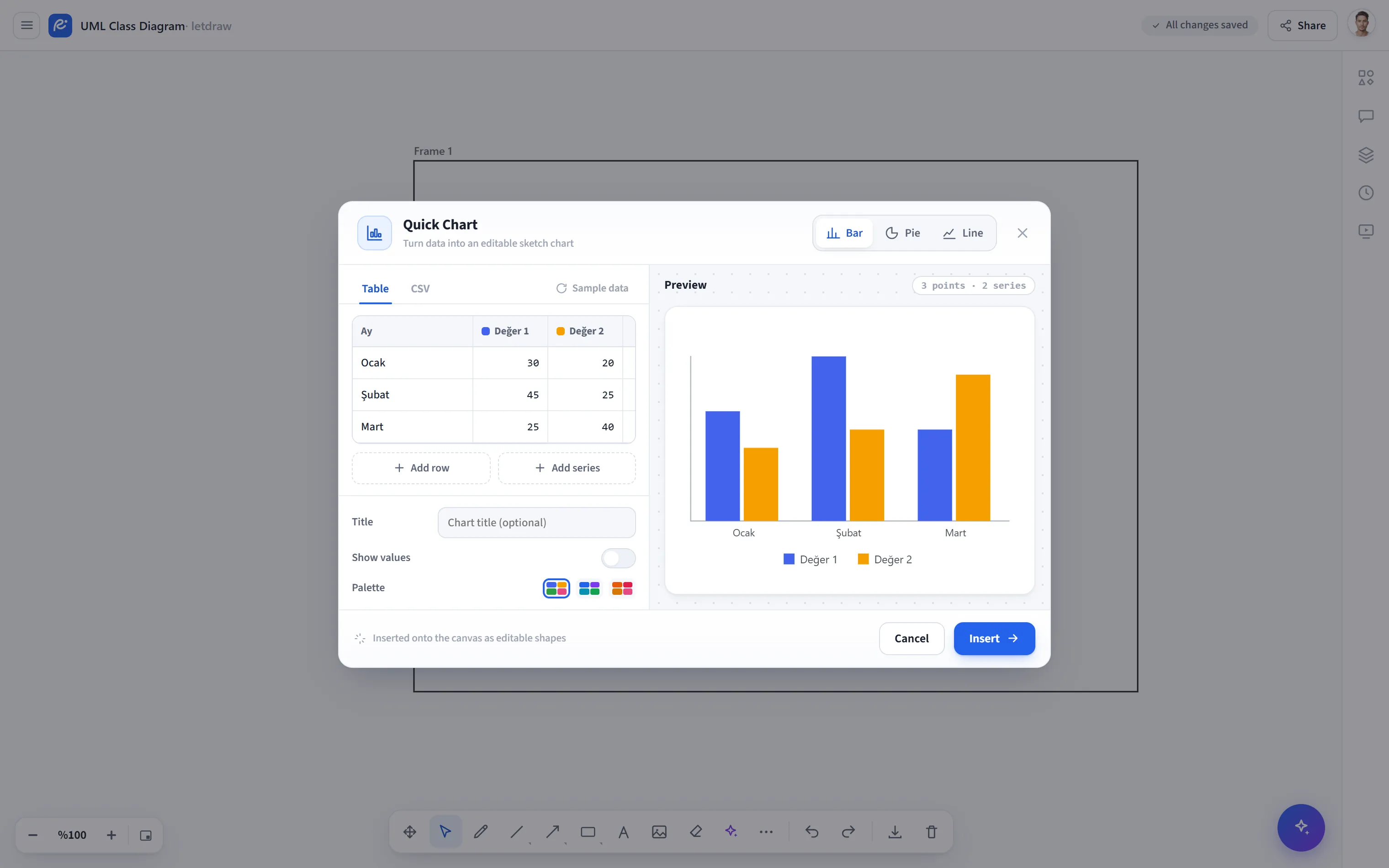
The default is a grid (table) editor; you enter data directly into cells without writing CSV:
- The first column holds the labels (the header cell is “Label”); each additional column is a series, with a small color box next to its header showing its color.
- Grow the table with Add row and Add series.
- Use the cross at the end of each row to Delete row; use the cross in the series header to Delete series (at least one series remains).
- If you edit the series headers, they become the legend labels.
If you prefer to paste as text, use the CSV tab. Each line is a record; values are separated by commas (or tabs). The first column is the label, the remaining columns are each a series. An optional header row sets the series names:
Ay, Değer 1, Değer 2Ocak, 30, 20Şubat, 45, 25Mart, 25, 40If you provide a single column, a classic single-series chart is generated. The two tabs share the same data; a change you make in one is reflected in the other. The Sample data button lets you start with a ready-made table.
Options
Section titled “Options”Below the data editor:
- Title: an optional title to appear above the chart.
- Show values: displays the numeric values on the bars/slices/points.
- Palette: choose the chart’s color palette; the selected palette is applied to both the preview and the added shapes.
Preview and adding
Section titled “Preview and adding”- In the live preview on the right, you see the final look of the chart and how many data points and how many series there are.
- Use Add to place the chart at the visible center of the canvas as editable shapes.
- In multi-series bar and line charts, each series is drawn in a separate color and a legend is added.
- A pie chart uses only the first series (a warning is shown for multi-series data).
- Because the chart is made of shapes, it can be edited individually after adding and is included in PNG/SVG/PDF exports.